Before you start
- Permissions: the page is visible to every user (Reader, Editor and Administrator) who has the
View executive summary(Zobrazit manažerský souhrn) access switch enabled for the company. - Data: the summary is based on the loaded accounting data and the income statement mapping. Incomplete mapping of income statement categories shows up here too (for example a lower gross profit).
Opening the page and its layout
Click Reports › Executive summary in the left menu. Under the page title you see the subtitle “Key financial indicators and cash flow outlook”. The page has three parts: the top toolbar with settings, a row of KPI tiles, and below them the due-date calendar and the charts.
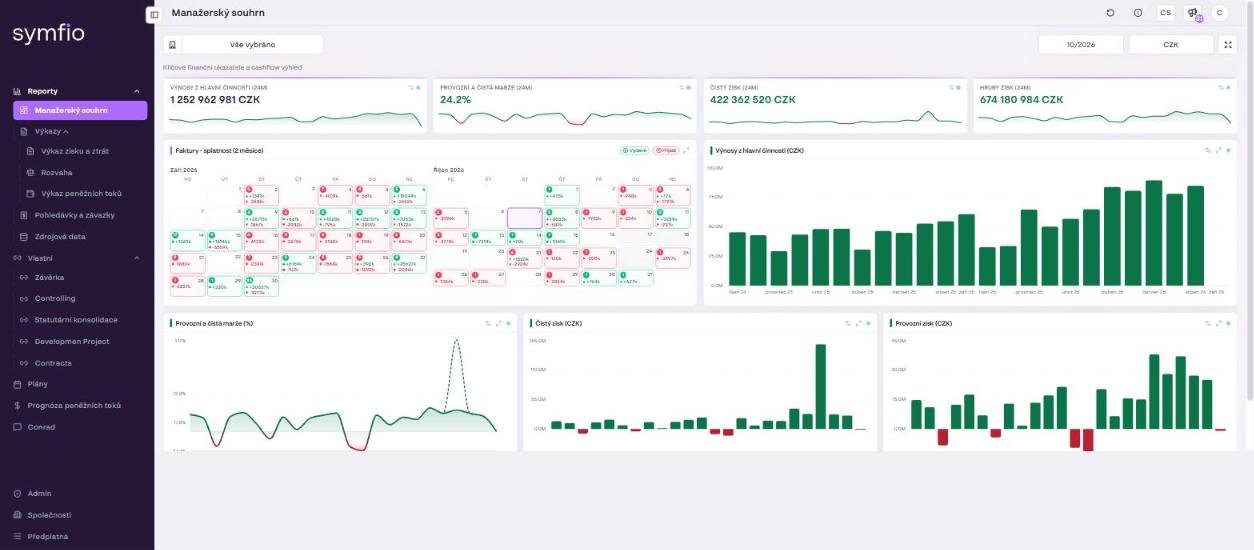
Toolbar
| Control | What it does |
|---|---|
| Company selector (building icon, text “All selected”) | Select one, several or all companies. Several companies = a consolidated summary for the group. Confirm with Apply. |
| Month (for example “10/2026”) | The month the summary is calculated to. The 24-month KPIs and the charts end with this month. |
| Currency (“CZK” button) | Converts all values into another currency. Useful for groups with entities in EUR or USD. |
| Fullscreen | Hides the menu and header – ideal for presenting in a meeting or on an office screen. |
| Default settings (Výchozí nastavení) | Restores the original widget layout if you have rearranged or resized the widgets. |
KPI tiles (24 months)
Four tiles summarise the development over the last 24 months up to the selected month. Each shows the current value and a small chart (sparkline) that reveals the trend.
- CORE REVENUE (24M) (Výnosy z hlavní činnosti) – revenue from the main business (the income statement category Revenue).
- OPERATING AND NET MARGIN (24M) – operating margin and net margin in per cent.
- NET PROFIT (24M) – the result after all costs and revenues.
- GROSS PROFIT (24M) – revenue less gross (direct) costs.
Note: The indicators correspond to the Income statement rows (Revenue, GROSS PROFIT, OPERATING MARGIN, NET PROFIT, NET MARGIN). If a value looks wrong, open the statement and check the mapping of income statement categories.
Invoices – due dates (2 months) widget
A two-month calendar shows how many invoices, and of what value, are due on each day. It is a quick outlook of short-term cash flow.
- Use the Issued (Vydané) / Received (Přijaté) switch to choose between receivables (what you are owed) and payables (what you have to pay).
- Read the number of documents and the total amount in each day: inflows are shown with a + sign in green, outflows with a − sign in red.
- Watch the coloured dots next to the days – they signal the due-date status of the documents (overdue vs. within terms).
- Open the individual documents in the Receivables and payables report if you need specific invoices.
Charts
Below the KPI tiles are four charts for the same period. Hover over a bar or point to see the exact value.
| Chart | What it shows |
|---|---|
| Core revenue (CZK) | Revenue bars by month – seasonality and growth. |
| Operating and net margin (%) | Two lines: Operating margin % and Net margin %. The gap between the lines shows the effect of other costs and revenues (interest, taxes). |
| Net profit (CZK) | Monthly net profit or loss. |
| Operating profit (CZK) | Monthly operating result before other costs and revenues. |
The chart title includes the currency in which values are displayed – when you switch the currency in the toolbar, the label changes too.
How to read colours and icons
- Green = positive value or inflow; red = negative value or outflow. The same convention applies across the application (for example the Δ column in the statements).
- Each widget has icons in its corner for settings, expand and fullscreen. You can enlarge a single chart to the full screen without losing the rest of the layout.
- You can adjust the widget layout; the Default settings button takes you back to the original layout at any time.
Tips and common mistakes
Tip: For a management meeting, select the whole group, set the last closed month and switch to fullscreen. The 24-month charts give you a year-on-year comparison without any further setup.
Caution: The summary works with data as of the time shown in the footer “Accounting data updated”. Documents posted by your accountant later will appear only after the next data update.
Tip: Ask Conrad (the AI controller) “why did the margin drop”. It explains the change and finds the largest cost items.
Frequently asked questions
Why do the summary values differ from the income statement?
Check that both views have the same company selection, the same currency and the same month. The summary always shows the last 24 months up to the selected month.
Can I change the KPI tile period to something other than 24 months?
The tiles are fixed at 24 months. For other periods use the Income statement with the period selector.
What does a red number in the due-date calendar mean?
It is the total of received invoices (outflows) due on that day. A green number with a + sign is the total of issued invoices (inflows).
Why can't I see the Executive summary for one of the companies?
Your administrator has not enabled the View executive summary access for you on that company. Ask them to adjust it on the Users tab.